Senior Member
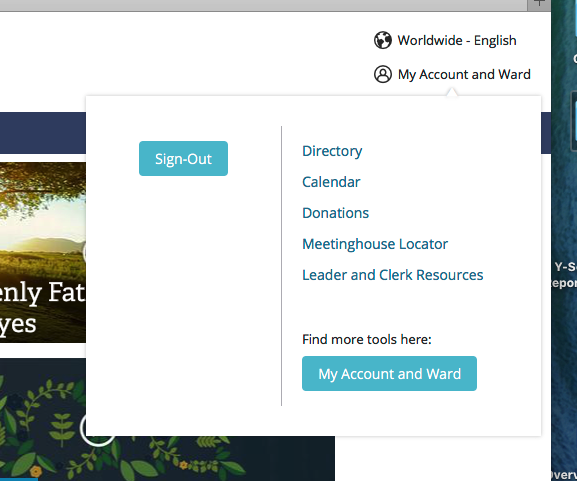
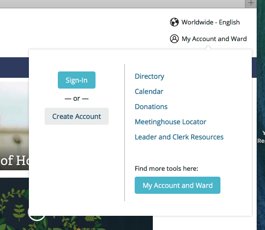
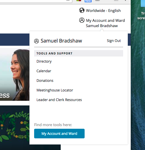
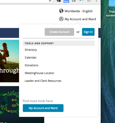
Today I encountered a new My Account and Ward menu at lds.org. The menu now has very few items on it and a blue button that takes you to a My Account and Ward page (http://abn.ldschurch.org/pgs/lds-account/v2.html).
I'm guessing this is an attempt to help church members discover information available to them by going to a page with more information about the tools; however, I really miss the old menu. It was a quick launch to many places I need to go. Now I have to load another page and possibly scroll the page to find the links I want (or maybe I'll have to start doing bookmarks to lds.org sites in my browser). This extra page load will be especially painful at church with a often-slow internet connection. It will force me to load another page on my way to where I'm trying to go and then I need to find the link on the page.
I don't mind the new page, but I wish the button taking you to the page was added to the My Account and Ward menu without removing the items that previously existed.
I'm guessing this is an attempt to help church members discover information available to them by going to a page with more information about the tools; however, I really miss the old menu. It was a quick launch to many places I need to go. Now I have to load another page and possibly scroll the page to find the links I want (or maybe I'll have to start doing bookmarks to lds.org sites in my browser). This extra page load will be especially painful at church with a often-slow internet connection. It will force me to load another page on my way to where I'm trying to go and then I need to find the link on the page.
I don't mind the new page, but I wish the button taking you to the page was added to the My Account and Ward menu without removing the items that previously existed.