Font rendering problems in firefox on new.lds.org

14 postsstarted by darcher-p40 5,726 viewsoriginal topic

New Member
#1
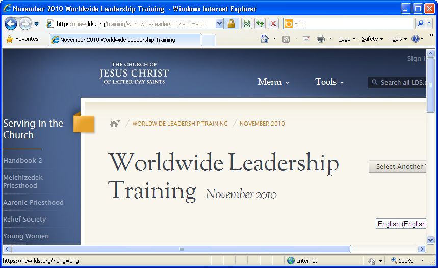
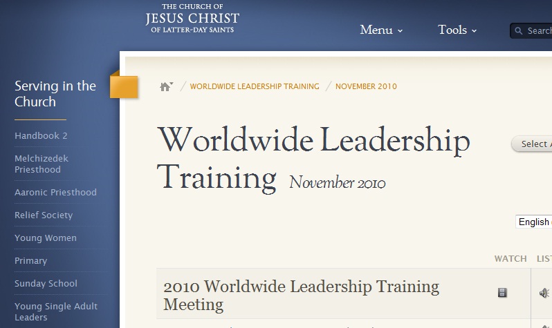
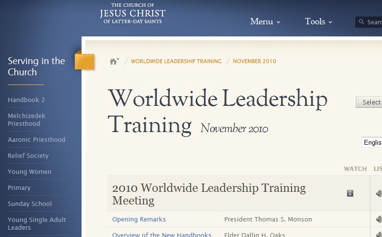
When I go to the new.lds.org page in firefox (or the recently posted worldwide leadership training page), the font for the title text (eg "Worldwide Leadership Traning Novermber 2010") as rendered in Firefox 3.6.8 (default settings) on a Windows XP machine looks pretty bad. It looks much better in IE. I've attached screenshots of both. I'm not exactly sure what is causing the difference, but I would suggest using a font that is browser agnostic, not one that looks pretty in IE and ugly in other browsers.

I know I'm not the only one using Firefox on here, has anyone else seen this problem?

Community Administrator
#2
darcher wrote:I know I'm not the only one using Firefox on here, has anyone else seen this problem?
I see no problem at all. I'm using FF 3.6.12 on Windows 7 and IE 8. On the images I attached, FF and IE are virtually indistinguishable, except that FF looks a bit better on the button on the right.
๐Ÿ“Ž FF WWLT.jpg (81.17 KiB)
๐Ÿ“Ž IE WWLT.jpg (88.17 KiB)
Questions that can benefit the larger community should be asked in a public forum, not a private message.
Senior Member
#3
Firefox 3.6.12 was released probably within two days of the event, so the programmers may hot have had a chance to review their work using it, or if they did they might not have noticed any issues.

Looking at the screenshots I'm seeing no major problems, slightly different rendering of the small text below 'Worldwide Leadership Training'. I've got 3.6.12 and have seen nothing of this type of problem, and yes MSIE 8 in XP is working very well with the same pages.
Community Moderators
#4
darcher wrote:. . . the font for the title text (eg "Worldwide Leadership Traning Novermber 2010") as rendered in Firefox 3.6.8 (default settings) on a Windows XP machine looks pretty bad. It looks much better in IE.
Your screen shot of the FF browser seems to show that the text is not clear and precise as it is in IE. I do not have this problem with FF (3.6.12). Perhaps I am using different browser settings, but I do not recall changing anything from the default.

Both browsers (IE 7 and FF 3.6.12) display the text with the same clarity for me.
Community Administrator
#5
I was about to complain that it looked ugly in IE8 when I remembered I was using Terminal Service to get into the machine that has my web browser. :o

It appears that it's a font that looks ugly quickly if the pixels don't map perfectly. You might want to make sure that your page size is set to 100%, etc.
Have you searched the Help Center? Try doing a Google search and adding "site:churchofjesuschrist.org/help" to the search criteria.

So we can better help you, please edit your Profile to include your general location.
New Member
#6

I think it's a firefox in Win XP problem

So I checked the webpages on my home computer which had Firefox 3.6.12 and Windows 7 and the font looked fine. When I came in to work this morning, I updated Firefox to 3.6.12 and checked again and it still looks bad. And I checked that I'm not zoomed in or out and all other settings are the default settings. So it appears that this is some kind of problem with Firefox on Windows XP. Can anyone check this using that combination?

edit: also, the jpegs I attached in the OP actually make the font look a little better than it does on my screen because of the way it compresses things. The font looks really jagged on my monitors. It's like a Pirates of the Carribean, trying to look old and decrepit font :). Which I'm sure was not the original intent!
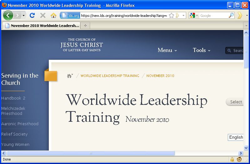
edit2: just installed Chrome and it looks the same as Firefox--really jagged text.
Community Moderators
#7
I use FF w/win XP and I've not noticed any problems. The screens are sharp and clear. Same thing with FF and Win 2000 Pro (an older system at work) - no problems.
Have you read the Code of Conduct?
New Member
#8
And you don't see any difference between the font as rendered in FF/Chrome vs IE8?
Community Moderators
#9
darcher wrote:And you don't see any difference between the font as rendered in FF/Chrome vs IE8?
I will do another comparison when I get home this evening. However, I was on the site last night and FF is my primary browser and I've not noticed any problems.
Have you read the Code of Conduct?
Community Administrator
#10
darcher wrote:And you don't see any difference between the font as rendered in FF/Chrome vs IE8?
Have you checked your ClearType settings? Those are available on Control Panel > Display > Appearance > Effects, if I remember right. Make sure you are using ClearType to smooth edges of screen fonts.
Questions that can benefit the larger community should be asked in a public forum, not a private message.
New Member
#11
Alan_Brown wrote:Have you checked your ClearType settings? Those are available on Control Panel > Display > Appearance > Effects, if I remember right. Make sure you are using ClearType to smooth edges of screen fonts.
You sir, are a genius. And that's why I love the community knowledge effect of the internet. Changing my ClearType settings did the trick. Now why would that have been disabled? Is that the default WinXP setting or just something HP Compaq (my work computer's manufacturer) does on their own? Also, what is the difference between ClearType and Standard font smoothing (the two options I have under Display-->Appearance-->Effects)?
Community Moderators
#12
darcher wrote:Now why would that have been disabled? Is that the default WinXP setting or just something HP Compaq (my work computer's manufacturer) does on their own?
Microsoft explains in their Clear Type: frequently asked questions that clear type is turned on by default. I don't know how it happens but I have found many systems with the setting at Standard. If for any reason you change your video color setting below 256 colors it will change the smoothing to Standard.
darcher wrote:Also, what is the difference between ClearType and Standard font smoothing (the two options I have under Display-->Appearance-->Effects)?
The FAQ I mentioned above explains it. There are many web sites that explain this in some detail. The first one I came across has a good explanation of font smoothing.
JD Lessley
Have you tried finding your answer on the ChurchofJesusChrist.org Help Center or Tech Wiki?
New Member
#13
Yeah, I was reading about that. Your first link only applies to Vista (and Win7 I presume). From what I read, the default smoothing for XP should be Standard. So I'm still not sure why it was disabled entirely on my machine. And the reason it looked better in IE is that IE7 forward uses ClearType regardless of the OS setting.
Church Employee
#14
Hi - I'm the lead developer for new.lds.org and I just wanted to give a quick update on the font issue. We are seeing some problems with fonts in different browsers, independent of the clearType issue. We are currently working on a solution and should have something implemented quite soon. Please let us know if you see any other issues!

thanks!
Mindie