Is lds.org front page supposed to look disjointed?

8 postsstarted by rmrichesjr 3,755 viewsoriginal topic

Community Moderators
#1
Is the http://www.lds.org front page supposed to look disjointed? For the past week or two, the division between the blue-gray upper area and the tannish lower area is broken up, and there are dark gray divots in the upper corners of the center part of the lower section. See the attached screenshot. This was taken using Firefox 3.0.14 on Mandriva Linux 2009.0. I do have minimum font sizes scaled up slightly, which seems to cause a few problems with web sites that are coded without geometrical robustness.
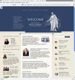
ldsdotorg-front-page.jpg
ldsdotorg-front-page.jpg (15.57 KiB)
Community Moderators
#2
rmrichesjr wrote:Is the http://www.lds.org front page supposed to look disjointed? For the past week or two, the division between the blue-gray upper area and the tannish lower area is broken up, and there are dark gray divots in the upper corners of the center part of the lower section. See the attached screenshot. This was taken using Firefox 3.0.14 on Mandriva Linux 2009.0. I do have minimum font sizes scaled up slightly, which seems to cause a few problems with web sites that are coded without geometrical robustness.

I'm not seeing any problem with the front page of LDS.org here. I've tried both IE8 and FF3.5.3
Have you read the Code of Conduct?
New Member
#3
The 'f' icon in the top corner looks to be a blocked flash object, for some reason positioned strangely. The other problem may a font problem or something. Im using Gentoo Linux and FF 3.5.3. I have also tried in with FF 3.5.3 and Chrome on windows, and it still seems to be the same. The christus image seems to be pushing the rest of the page down. For me, its not pushed quite as far down as for you, but still a good 15 pixels or so. In IE, though, it isn't broken like that. Maybe someone recently changed something, only testing in IE.
Community Administrator
#4
faazshift wrote:The 'f' icon in the top corner looks to be a blocked flash object, for some reason positioned strangely. The other problem may a font problem or something. Im using Gentoo Linux and FF 3.5.3. I have also tried in with FF 3.5.3 and Chrome on windows, and it still seems to be the same. The christus image seems to be pushing the rest of the page down. For me, its not pushed quite as far down as for you, but still a good 15 pixels or so. In IE, though, it isn't broken like that. Maybe someone recently changed something, only testing in IE.
It works fine for me in FF 3.5.3 on Windows. I can zoom just the text, or the whole page, bigger or smaller, and it looks just fine.
Questions that can benefit the larger community should be asked in a public forum, not a private message.
New Member
#5
Alan_Brown wrote:It works fine for me in FF 3.5.3 on Windows. I can zoom just the text, or the whole page, bigger or smaller, and it looks just fine.
Well now its working, but at the time of my post it was doing what I described.
Community Moderators
#6

Fixed, here, too.

Hmmm... It appears fixed for me, too. I guess maybe the right somebody saw this thread.
New Member
#7
It appears by your thumbnail that the central welcoming image at the top was merely overlapping the page setup. This can be common from time to time depending on your web browser, however it can usually be corrected easily. I'm glad to hear that this has been resolved.
Jace Voracek
Jace@Jace-Place.com
Church Employee
#8

Actual Resolution

A big thanks to rmrichesjr for bringing this up. Interestingly it was still a problem until about 10 minutes ago. It only happens however the first time you hit the page after your local cache has been cleared. It was related to the sharing feature added to the videos we have on the home page. If you are interested, you can read about that flash object that was pushing the alignment off here: http://www.addthis.com/blog/2009/01/05/ ... -feedback/

Since it was breaking the layout we have disabled the flash tracking "feature" for now.

Thanks!