LDS.org to get major style update, updated header

24 postsstarted by barkeraj 7,574 viewsoriginal topic

Church Employee
#1
If you haven't already seen it, there is a Deseret News article here
http://www.deseretnews.com/article/8656 ... -time.html

There are two main components to this update. 1 - The new header. 2 - The rest of the site will be updated with a new look.

New Header
The core navigation will stay the same, just move down below the logo. The "My Tools" will be expanded and reorganized. The style will change from blue to white. There are some really tricky language handling that has been updated, that I may write something up on in the future.

Updating the content area
The entire site will be moving to a new style with the background becoming white (from the current tan), new fonts, increased font sizes and new accent colors being used. There are lots of sections of the site, so some sections will not be updated this round, but will in coming weeks and months.

In reality this is a fairly "basic" style update (months of work beg to differ), not a full redesign. For those web geeks out there, this is all being done via CSS updates, not any code updates (except for the header which is a complete rewrite). Full redesigns of sections and templates will come in the future.

We fully realize that there will be issues here and there that we will be working to resolve as they are reported. Feel free to report issues you see after the release and we will add them to our list to prioritize and take care of as soon as we can.

Just wanted to give people a little heads up if you haven't seen the Deseret News article that this is coming soon so you aren't surprised by the update. Hopefully you will like it.
Aaron Barker
Front-end Development Lead for LDS.org (content portions, not apps) and Ward Executive Secretary.
Community Moderators
#2
Hi – first of all, thank you for all of the months of work that went into the redesign. Change is always exciting. Apologies that this post will be mainly critique of little details. :)

First, there is no indication whether or not I am currently signed in. Clicking on "My Account and Ward," I still see the "Sign In" button. The old design was confusing (with the text changing), so I don't want to mimic that, but it would be nice if the text "My Account and Ward" changed to a different color (green for "On"?) when I log in, or something similarly simple but visible. Then, opening the menu, in place of the "Sign In" button it could have a simple "Sign Out" link, and to the left it could have my LDS Account username (or my full name, or both).

Second, "Worldwide - English" should have an en-dash instead of a hyphen.

Third, I think you should consider switching the country so it comes after the language: "English – Worldwide" or "Español – México". Then, you can move the globe and person icons to the right side of the text and right-align them to the right edge of the screen.

Fourth, "Worldwide - English" and "My Account and Ward" should have dropdown arrows to make it clear they're menus, not links.

Fifth, I don't want my web browser to feel like a tablet. I understand it simplifies things for the developers to not have to create two separate designs. Also, more and more internet traffic is coming from mobile devices. Most of my concerns with this have to do with either 1) margins that are too big around elements (like navigation links and menu items), or 2) not enough margins at the edge of the page. Proper margins frame the content, allowing a user to see everything in context. They decrease the amount of scrolling needed and improve readability and ease of navigation. On a small touch screen you have to cut margins in some places and increase them in others, but on a big screen controlled by a mouse or trackpad it's cumbersome.

Finally, while I like the neo-typewriter title font, using it all over the place (rather than just a logo or main title) feels unprofessional (whether on a web site or in a mobile app). I understand that this may already be decided in style guides and may not change, but I figure it's worth throwing in my thoughts about it.
Samuel Bradshaw • If you desire to serve God, you are called to the work.
Community Administrator
#3
sbradshaw wrote:First, there is no indication whether or not I am currently signed in. Clicking on "My Account and Ward," I still see the "Sign In" button. The old design was confusing (with the text changing), so I don't want to mimic that, but it would be nice if the text "My Account and Ward" changed to a different color (green for "On"?) when I log in, or something similarly simple but visible. Then, opening the menu, in place of the "Sign In" button it could have a simple "Sign Out" link, and to the left it could have my LDS Account username (or my full name, or both).
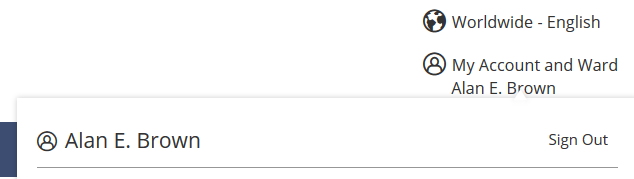
I'm apparently not seeing what you're seeing. Because what I'm seeing is almost exactly what you're suggesting (except for the text color change you proposed). I definitely see my name when I'm signed in (even before I drop down the menu). So there's no doubt in my mind whether I am signed in or not. I wonder if you have caching issues or something else causing this odd behavior.

Here's what I see when signed out:
ldsorg-out.png
(9.04 KiB) Not downloaded yet
And what I see when signed in:
ldsorg-in.png
(9.02 KiB) Not downloaded yet
Questions that can benefit the larger community should be asked in a public forum, not a private message.
Community Administrator
#4
I was wondering what update you guys were talking about. I had to hit Ctrl-F5 to see the update. (I didn't try just F5.)
Have you searched the Help Center? Try doing a Google search and adding "site:churchofjesuschrist.org/help" to the search criteria.

So we can better help you, please edit your Profile to include your general location.
Community Moderators
#5
aebrown wrote:I definitely see my name when I'm signed in (even before I drop down the menu). So there's no doubt in my mind whether I am signed in or not. I wonder if you have caching issues or something else causing this odd behavior.
I get no indication that I am signed in because the site acts as if I have never signed in. When I click on the Sign In button, I get the same page refreshed, and do not get sent to a login page.

If I sign in to the Forum and then go to LDS.org, my position and unit display, but my name does not and I still see the Sign In button when I hit the drop down menu.

So it knows who I am, but it still behaves as if I am not signed in, and does not allow me access to any of the extra leader and clerk resource items I need. Fortunately, I have kept my direct links.
Community Administrator
#6
I'm not fond of having to click a button just to get to the sign-in button or tools. I understand that keeps the interface uncluttered, but it makes for additional click for what is likely to be a common destination for members.

I'd like to see a cookie that the site can use to sense if this is probably a member or not. Computers with the cookie would get the current site. Computers with the cookie (that's shows there was a prior member login) would get an additional top-level tool/quick link section even if currently logged out.
Have you searched the Help Center? Try doing a Google search and adding "site:churchofjesuschrist.org/help" to the search criteria.

So we can better help you, please edit your Profile to include your general location.
Community Administrator
#7
lajackson wrote:I get no indication that I am signed in because the site acts as if I have never signed in. When I click on the Sign In button, I get the same page refreshed, and do not get sent to a login page.
I'm seeing something similar. If I use IE11, go to the lds.org page and log in, I'm back at the lds.org main page and my name doesn't display. But I can navigate to Directory. The directory shows my name, but Calendar does not.
Have you searched the Help Center? Try doing a Google search and adding "site:churchofjesuschrist.org/help" to the search criteria.

So we can better help you, please edit your Profile to include your general location.
Community Administrator
#8
russellhltn wrote:I'm not fond of having to click a button just to get to the sign-in button or tools. I understand that keeps the interface uncluttered, but it makes for additional click for what is likely to be a common destination for members.
I don't see how any of the common destinations have any additional clicks. You just click on the dropdown for "My Account and Ward" then click on your desired destination. If you're signed in, you go to that destination directly; if you're not signed in, then you'll be prompted to sign in along the way. That's the same number of clicks as would be required for your proposed change.

The only scenario where there is an extra click is where you need to sign in first before you can see the link for the tool you want to use. That certainly wouldn't affect any common destinations, but for some leaders it would affect some portion of the tools they want to use.
Questions that can benefit the larger community should be asked in a public forum, not a private message.
Community Administrator
#9
russellhltn wrote:
lajackson wrote:I get no indication that I am signed in because the site acts as if I have never signed in. When I click on the Sign In button, I get the same page refreshed, and do not get sent to a login page.
I'm seeing something similar. If I use IE11, go to the lds.org page and log in, I'm back at the lds.org main page and my name doesn't display. But I can navigate to Directory. The directory shows my name, but Calendar does not.
Hmm. I see my name in every case, using Chrome, Firefox, and IE11. I didn't even have to clear my cache, and it worked the first time and every time on every part of LDS.org I've tried, with all 3 browsers.

But some of the odd behavior people are reporting sounds like browser cache issues. Have you tried clearing your cache?
Questions that can benefit the larger community should be asked in a public forum, not a private message.
Community Moderators
#10
aebrown wrote:But some of the odd behavior people are reporting sounds like browser cache issues. Have you tried clearing your cache?
Yes. I have also noticed that the page is considerably slower to load. I have better success (but not complete success) if I wait longer before I try to do anything.

The header has never behaved properly when I have gone to LDS.org after being signed in here. Those same problems still exist.

If I completely sign out, clear the cache, and then go to LDS.org, it behaves more normally, but my name still does not appear. Maybe if I wait a little longer . . .

But I am an impatient kind of fellow. I'll have more time to play with it this evening, and on a different computer.
Community Moderators
#11
Another item of feedback: The church logo isn't prominent enough, being overwhelmed by the account and region menus on the left. I would suggest making the logo a bit bigger, moving it up a couple of pixels, moving the account and region menus down a bit, and reducing the vertical margin between the account and region menus.
Samuel Bradshaw • If you desire to serve God, you are called to the work.
Church Employee
#12
Thanks for the feedback folks. I won't respond to specific design concerns at the moment, but the weird login state is an issue we have just been made aware of. It is only affecting some people. You don't see your name or logout options but you are still logged in and able to go to sections that require authentication (directory, calendar, etc). We are looking into it.
Aaron Barker
Front-end Development Lead for LDS.org (content portions, not apps) and Ward Executive Secretary.
Community Administrator
#13
aebrown wrote:I don't see how any of the common destinations have any additional clicks.
More than the old way? No.

But with the re-design I become aware of how many clicks it does take. I can't think of any other site where I have to do two mouse clicks to get to the login screen.
Have you searched the Help Center? Try doing a Google search and adding "site:churchofjesuschrist.org/help" to the search criteria.

So we can better help you, please edit your Profile to include your general location.
Church Employee
#14
We believe that the issue around the sign in loop and not seeing your name and sign out link has been fixed. Please give it another try and let us know if you still have problems.
Aaron Barker
Front-end Development Lead for LDS.org (content portions, not apps) and Ward Executive Secretary.

Community Administrator
#15
russellhltn wrote:
aebrown wrote:I don't see how any of the common destinations have any additional clicks.
More than the old way?
No, I meant no additional clicks over your proposed change.
Questions that can benefit the larger community should be asked in a public forum, not a private message.
Community Administrator
#16
aebrown wrote:No, I meant no additional clicks over your proposed change.
On closer examination, Calendar and Directory are there under "Quick links" (have to scroll down a bit). If that section could be made sensitive to if this browser was previously used by a member who had logged in as opposed to a non-member/visitor and adjusted the quick links appropriately, that would help.

But in that case I'd like to see quick links move up high enough so that no scrolling was needed.
Have you searched the Help Center? Try doing a Google search and adding "site:churchofjesuschrist.org/help" to the search criteria.

So we can better help you, please edit your Profile to include your general location.
Community Moderators
#17
barkeraj wrote:We believe that the issue around the sign in loop and not seeing your name and sign out link has been fixed.
It appears to be working for me now.
JD Lessley
Have you tried finding your answer on the ChurchofJesusChrist.org Help Center or Tech Wiki?
New Member
#18
I like the new site much better. To me is less cluttered and puts focus where it needs to be. I like the white background. To me it's much easier to concentrate on the items that need concentrating on.

I hope you all don't do anything major with the site in the near future with all the feedback I'm sure you are to get. The one thing that annoys me the most are sites that keep changing almost weekly and then I have to constantly refigure out the new way to login or get to a report I just looked at days before.

A update to the site that helps one person who gave feedback, could annoy and make another person frustrated. Consistency and training to me is the best approach for long term support. Of course, bugs and errors need immediate attention and need to get fixed.

Thats just my two cents.
Senior Member
#19
I am pleased that navigation has mostly remained the same. I got one of those surveys last year about a redesign and one of my big concerns about some of the proposed redesigns was not messing with navigation. It still feels pretty good to me, like I don't have to relearn everything.

One thing I've found I don't like is when reading scriptures and other articles: there is a maximum width for the content. No matter how big I make my browser window, the main text stops widening and I'm just left with lots of whitespace on the right and left of the content area. I have a 27 inch monitor. I know it can be hard on the eyes to have paragraphs that wide, but I prefer to control my reading experience by changing my browser window width; not having a site limit me. I do most of my study online and I find I really don't like the maximum width. The content is already adaptive for smaller screens; let's just get rid of the max width.
Senior Member
#20
mevans wrote:One thing I've found I don't like is when reading scriptures and other articles: there is a maximum width for the content. No matter how big I make my browser window, the main text stops widening and I'm just left with lots of whitespace on the right and left of the content area. I have a 27 inch monitor. I know it can be hard on the eyes to have paragraphs that wide, but I prefer to control my reading experience by changing my browser window width; not having a site limit me. I do most of my study online and I find I really don't like the maximum width. The content is already adaptive for smaller screens; let's just get rid of the max width.
I'm going to correct a little bit of my observation above. I happened to use a different computer last night that still had open pages from the old LDS.org. I guess content on the old LDS.org did have a maximum width; however, its maximum width didn't really bother me. I didn't look at technical details to see if the new maximum width is the same or less; there is a different font and size on the revised site. It's just that my overall observation in reading on the new lds.org is that I feel constrained with the maximum width; it's less than what I want it to be. I hope someone might increase it.

I suppose if no one does anything that I could install one of those browser add-ins that lets me tweak the CSS, but I'm going to hope that since barkeraj is asking for feedback that the church will at least review this consider changing it.
New Member
#21
Hi!

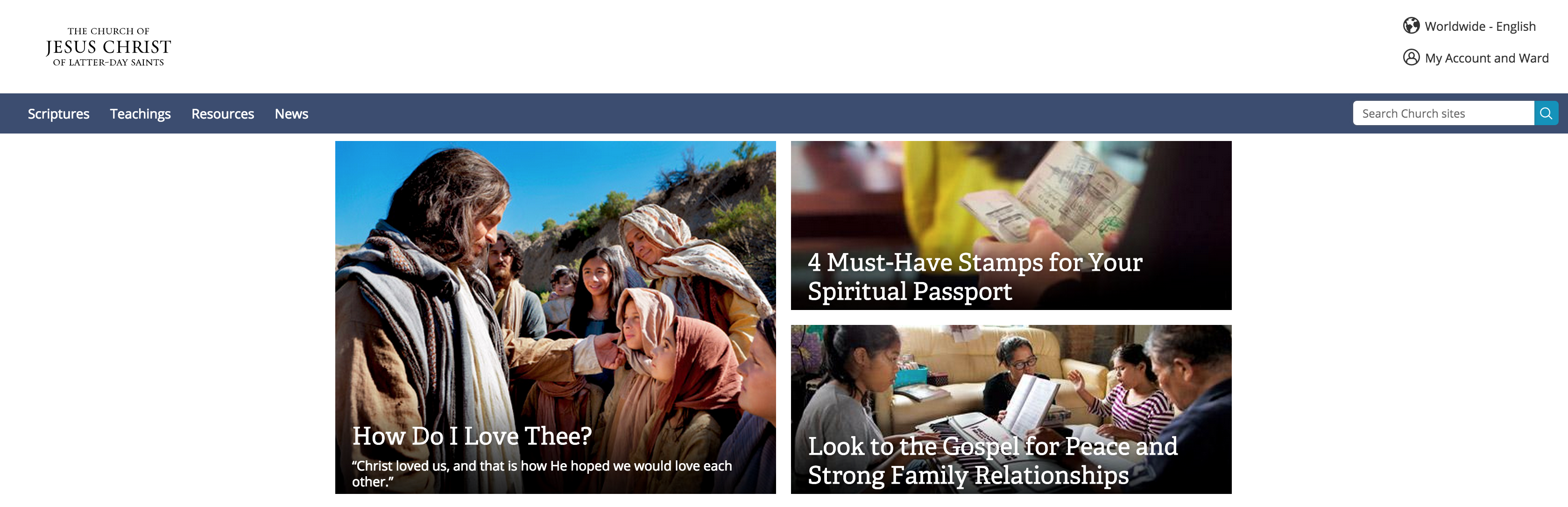
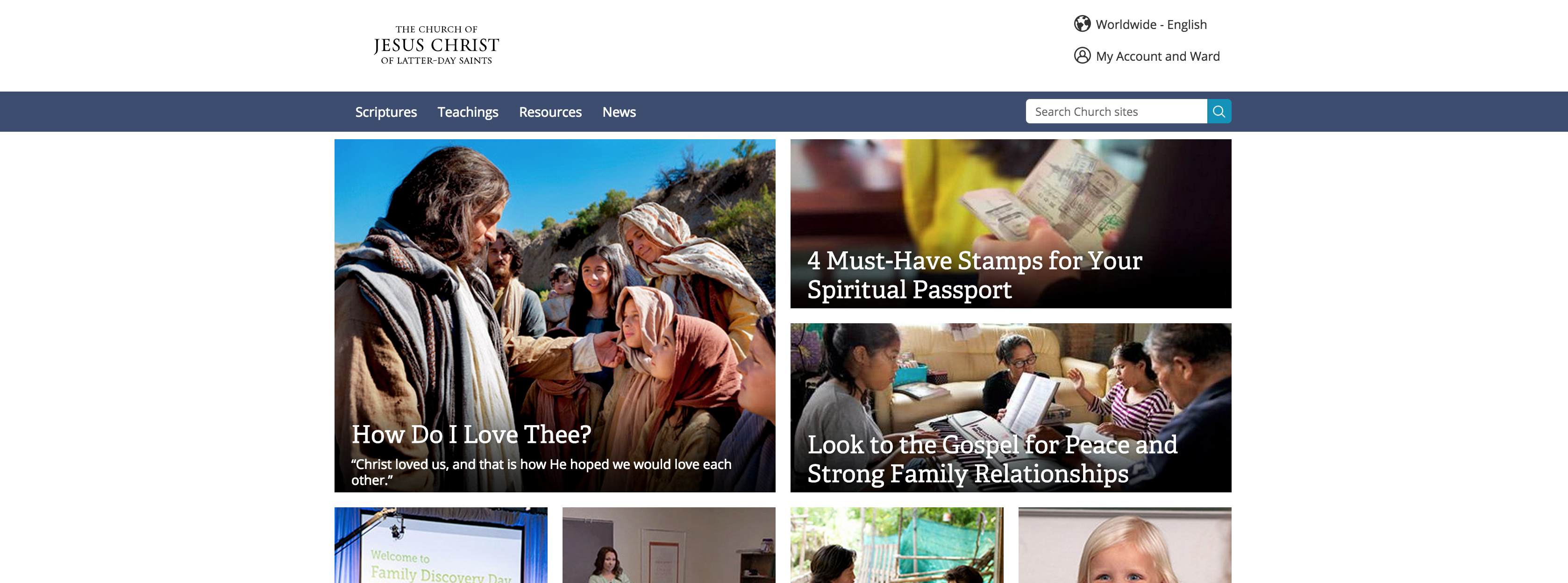
I love the new design. I just have a quick thought on the header on high-resolution screens. I appreciate the responsive, full-width approach to the new header, but in my opinion it would look better if you added a max-width property to the content of the header (not the blue line, it looks nice when it spans the width of the screen). I've included two screenshots. One, which is how it is today where the content of both sides of the header are actually on the "outside" of the content width of the website. And the second screenshot is a suggestion to how it could look.

Keep up the good work anyway!

Benjamin
Skjermbilde 2015-02-16 kl. 23.26.52.png
(2.38 MiB) Not downloaded yet
Skjermbilde 2015-02-16 kl. 23.30.54.png
(2.86 MiB) Not downloaded yet
Community Moderators
#22
mevans wrote:I happened to use a different computer last night that still had open pages from the old LDS.org. I guess content on the old LDS.org did have a maximum width; however, its maximum width didn't really bother me. I didn't look at technical details to see if the new maximum width is the same or less; there is a different font and size on the revised site. It's just that my overall observation in reading on the new lds.org is that I feel constrained with the maximum width; it's less than what I want it to be.
You can see the old LDS.org here:
https://web.archive.org/web/20150201183 ... /?lang=eng

I think the fact that the page is framed by a different color makes a big difference.
Samuel Bradshaw • If you desire to serve God, you are called to the work.
New Member
#23
I work as a designer. Just wanted to say awesome job Aj, keep up the good work!
New Member
#24
As a UI/UX designer, I second bweggersen's suggestion, especially on larger screens. Full-width is fine for smaller screen widths where it isn't as dramatic. I think a simple max-width would fix things, unless the current designers are taking into account other languages where super-wide text might affect the layout of items in the header. There are a ton of things to consider, but at first glance, I think bweggersen makes a good point.