No "Subscriptions" link

12 postsstarted by russellhltn 5,051 viewsoriginal topic

Community Administrator
#1
Clicking on the "gear" icon results in a list - but "Subscriptions" is no where to be found. Unable to find it anywhere else. Yet subscriptions are still in play as the list of calendars displayed is limited by my subscriptions in the production calendar. Calling: STS.
Have you searched the Help Center? Try doing a Google search and adding "site:churchofjesuschrist.org/help" to the search criteria.

So we can better help you, please edit your Profile to include your general location.
Church Employee
#2
The subscriptions link is removed on purpose you now subscribe by clicking the expander on the left panel. We are working on a video to point this out to people.
LDS.org Team
Community Administrator
#3
1. Subscriptions are still in effect. The list on the left panel is limited by my subscriptions set in production.

2. How will this affect the sync URL?

3. Would it be possible to keep subscriptions but have it only affect the sync? That would be my ideal.
Have you searched the Help Center? Try doing a Google search and adding "site:churchofjesuschrist.org/help" to the search criteria.

So we can better help you, please edit your Profile to include your general location.

Church Employee
#4
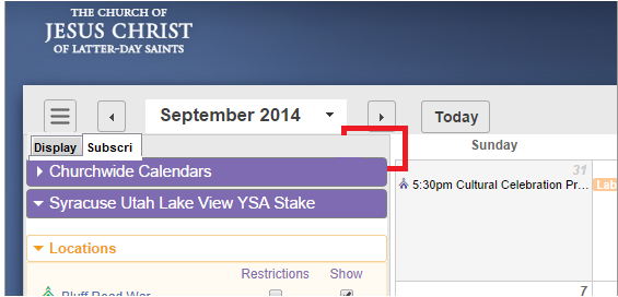
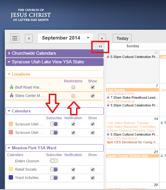
Subscriptions work the same as they did before you have to click the arrows on the left hand panel. look for the >> under the date. If your not subscribed it does not show up in the list.
📎 howtosubscribe.png (90.13 KiB)
LDS.org Team
Community Administrator
#5
Ok, I misunderstood what you were telling me.

I like that subscriptions is now integrated with the left panel, but the entry point is really hidden. Right now the beta seems to be down, so I can't confirm how it looks.

Any chance of changing it to a pair of tabs in the same bar?
Have you searched the Help Center? Try doing a Google search and adding "site:churchofjesuschrist.org/help" to the search criteria.

So we can better help you, please edit your Profile to include your general location.
Community Administrator
#6
Ok, it's back up now, so I can play with it. Clicking on the button does make the tool bar bigger, so I guess the icon is being used correctly, but it's about as intuitive as switching to "week view" to see building events. (We're constantly having to teach people that in the forums.)

Nice function, but the button doesn't do a good job of suggesting what it does.
Have you searched the Help Center? Try doing a Google search and adding "site:churchofjesuschrist.org/help" to the search criteria.

So we can better help you, please edit your Profile to include your general location.
Church Employee
#7
yes your right it is small we were hoping to have a intro video that drew the users eyes to the major interface items.

Restrictions and bulding events are now shown on both week and month view.
LDS.org Team
Community Administrator
#8
jeffevannelson wrote:Restrictions and bulding events are now shown on both week and month view.
Yes, I noticed that. That's a big improvement.

But I'd suggest you're using that graphic symbol in a unconventional way. I've only seen it used to open/close a element, not switch functions.

Is suspect the goal was to minimize the use of words as it creates language issues, but in my mind using graphic elements in a unusual way is worse. I'm thinking that helping people find the subscriptions page will be an ongoing support issue. Too many will skip the video to rely on that as a solution.

Here's a really crude mock-up of my suggestion:
Subscription.png
Subscription.png (35.05 KiB)
Have you searched the Help Center? Try doing a Google search and adding "site:churchofjesuschrist.org/help" to the search criteria.

So we can better help you, please edit your Profile to include your general location.
Community Administrator
#9
russellhltn wrote:But I'd suggest you're using that graphic symbol in a unconventional way. I've only seen it used to open/close a element, not switch functions.
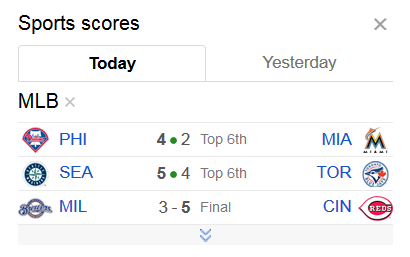
I don't see that icon being used to switch functions. Instead, it is being used to expand the view, and that is certainly a conventional usage. See, for example, Google News, which uses that icon all over the place to expand views. Here's an example:
GN-Sports.png
GN-Sports.png (16.98 KiB) Viewed 3625 times
When you use that icon in the Calendar to expand the view, you still have all the same elements that were first there -- a list of all the locations and calendars, with a checkbox to show or hide each location or calendar. It's just that you have additional options for subscriptions in the calendars section (and possibly restrictions in the Locations section).

So my opinion is that it is a very standard usage of that UI element -- it is indeed expanding a view, giving you additional options -- it is not changing functions.
Questions that can benefit the larger community should be asked in a public forum, not a private message.
Senior Member
#10
aebrown wrote:So my opinion is that it is a very standard usage of that UI element -- it is indeed expanding a view, giving you additional options -- it is not changing functions.
I don't have any problem with the symbol or it's usage. It seems reasonably standard to me.

What I'm concerned about is that I wouldn't have guessed that functionality was hidden there in the first place. That's not to say I think it's a bad place to put it. It looks pretty slick actually. I just think people aren't going to realize it's there and I'm not sure a video is really going to do the job.

Perhaps the gear menu could still have a Subscriptions option (at least when the side bar is in limited view mode) that would open the sidebar fully and perhaps show an automatic tooltip showing the user where to click to close it back down.
Community Moderators
#11
How close to being finalized is the UI? There are still several UI items I would consider changing...
Samuel Bradshaw • If you desire to serve God, you are called to the work.
Community Administrator
#12
sbradshaw wrote:How close to being finalized is the UI? There are still several UI items I would consider changing...
I would recommend that you not wait for the answer to this question, but rather just post your suggestions. Until the product team sees your suggestions, they can't know the priority they would attach to them. And even if the suggestions don't make it into this release, they could potentially affect future releases.
Questions that can benefit the larger community should be asked in a public forum, not a private message.