New Member
I currently have version 2.6.1.7 and have heard there is a newer version. How do iI download the newer version. James Urry
Your phone is where the preference for auto-update resides. For my phone, that preference is for all apps. There is no individual, or by app, setting. I have all my apps set for manual update but with a notice when an update is available.haneyrj wrote:I also do not appreciate it being updated without my approval.
On my phone there is a setting for all apps as well as setting for each individual app. The settings can be found in the Play Store.jdlessley wrote:haneyrj wrote:For my phone, that preference is for all apps. There is no individual, or by app, setting.
That's right - I forgot about that. I had changed those settings for those undesirable bloat apps that came with my phone that can't be fully removed without rooting and voiding the warranty.russellhltn wrote:The settings can be found in the Play Store.
Maybe I'm missing what you're talking about but I simply switched to the list view (using the second to leftmost button on the toolbar at the bottom - the one that looks like three horizontal lines) and then the interface is seems almost exactly like what it was except for a few font changes and some reorganization of how the content is grouped.kennychapman wrote:I also do not like the new interface. I am sure I am in the minority, but I don't like having the icons and GUI stuff, at least if there was a way to turn all of that off and have the old plain look I would be happier. I am going to install the older version and thanks for providing it here. I would love the additional content that is provided with the new version, I just can't stand the eye candy, especially if there is no way to disable it.

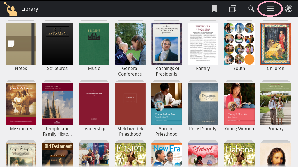
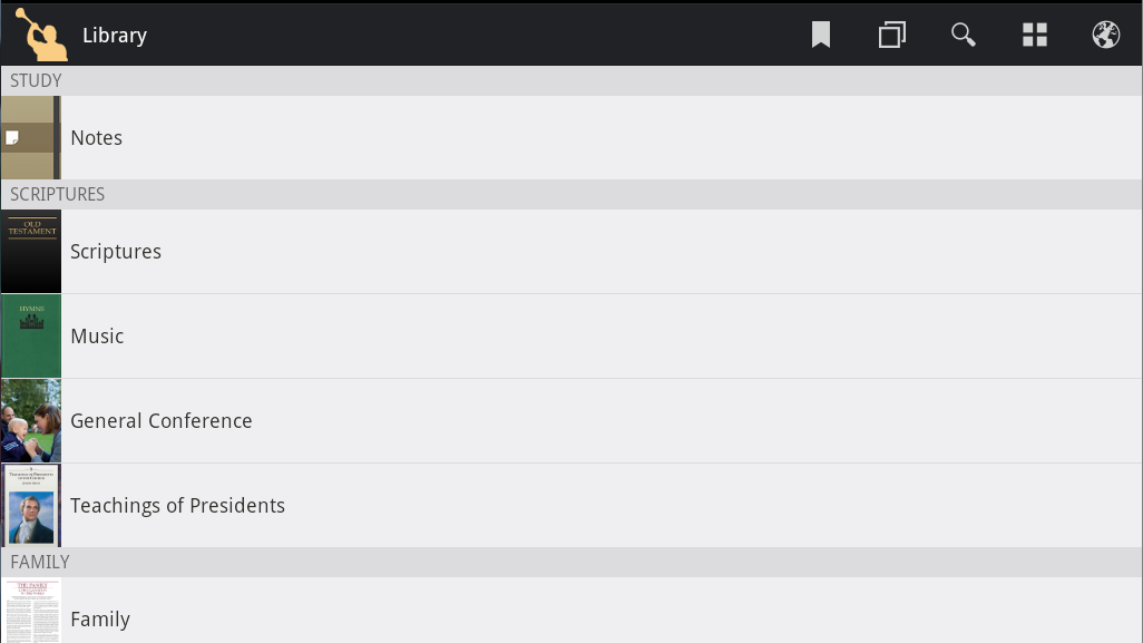
Just to be clear, the icon view looks like this: Clicking on the circled button (upper right corner) puts it into list view, which as eblood66 said, is quite similar to the older version:eblood66 wrote:Maybe I'm missing what you're talking about but I simply switched to the list view (using the second to leftmost button on the toolbar at the bottom - the one that looks like three horizontal lines) and then the interface is seems almost exactly like what it was except for a few font changes and some reorganization of how the content is grouped.
On further experimentation it looks like the location and contents of the toolbar changes depending on orientation and screen size. On my phone in portrait mode the toolbar shows at the bottom of the screen. I'm assuming aebrown's version is from a tablet or a larger screen phone in landscape mode. When I look at my phone in landscape mode the toolbar is in the top left of the screen but it only has two buttons. However, in that case there is a 'View as List' option on the menu (accessed via the menu hard button).aebrown wrote:Just to be clear, the icon view looks like this:eblood66 wrote:Maybe I'm missing what you're talking about but I simply switched to the list view (using the second to leftmost button on the toolbar at the bottom - the one that looks like three horizontal lines) and then the interface is seems almost exactly like what it was except for a few font changes and some reorganization of how the content is grouped.
Clicking on the circled button (upper right corner) puts it into list view, which as eblood66 said, is quite similar to the older version:

I agree. This problem with too many categories is in the content itself and shows up both in Android and in iOS. It is hard to navigate.lmcguire wrote:But the list view is a big, long list of practically everything. The old way had only 9 categories on the home page. From there, you drill down to what you want, which is (at least to the perception of some) a much faster way to get where you're going than to scroll through long lists. Everyone I've talked to who doesn't like the new layout, doesn't like it for this exact reason - scrolling through lots and lots of stuff.
(NOTE: researchers have determined that in a list of 7 or fewer items, a human can pick the one they want instantly, more quickly than they can read each individual item; but as soon as the list gets longer than that, the human has to read each item and say (to themselves, subconsciously) "that's the one I want" or "no, not this one". This may well be why some of us prefer the short lists & drill-down option.)
FWIW,
Liz